Your performance reports are the key to understanding your AdSense account activity and earnings. This is where you can get vital information about your account, quickly and easily. We’re constantly working to enhance performance reports, and so today, we’re introducing some changes that improve the usability of the reports and make them more visually compelling.
When you visit your “Performance reports” tab, you’ll notice changes like these:
- The graph area covers a wider area of the screen.
- The list of metrics has been moved from the right hand side to the top in an interactive scorecard.
- There are new buttons for day, week and month for the usual timeline graph to allow for more control over granularity when analyzing activity over longer time periods.
- You can choose “Events” on a timeline report graph or select the “Events” report from the left navigation to see how specific account changes are related to account performance.
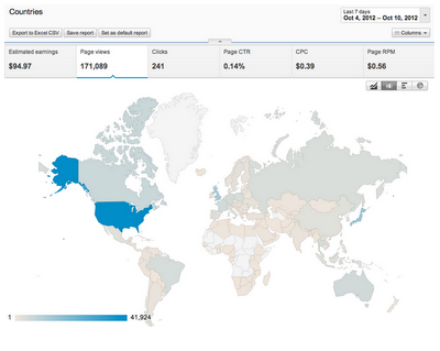
- There are new graph types available, such as pie or bar charts, to visualize the data you’re looking at. In addition, the “Countries” report shows you where your users are located on a world map:

We hope you enjoy these changes — stay tuned for more updates. For additional information visit our Help Center and feel free to leave comments and feedback on our AdSense +page.
Posted by Daniel White – Software Engineer, AdSense Reporting


